
Screen Gems is a small american production company and is not as well known as other larger more mainstream companies such as universal or lionsgate. it is mainly known for it's short films and animations however it's latest releases have been much higher budget and they are now becoming a larger more recognizable company.
The logo is unusually dark as it has been changed to fit with the horror genre of the film, the logo and words swirl onto screen and keep our attention throughout the clip. this is a very extravagant production logo compared to others we have seen as it is very modern.
The exorcist was produced by 'Warner Brothers'. Again the text is very bold and in block and bold colour, the colors used (black, white and red) have conventions of blood and death which links them to the horror genre. The logo moves onto the screen very quickly and the words fade in after, this means the audience focus on each piece of information individually as there is only once thing on the screen at a time. the logo and the words are again very central on the screen to make them the main focus.
Warner Brothers are a very classic production company and are not known for making horror films, they mainly produce blockbuster family films such as rom-coms and action and adventure films.
The poster i have created, will be displayed in many public places to get the film out and known by the public, places I will distribute the posters will be those such as; billboards, telephone boxes, and general TV advertisements. With the film being released in the summer, it would be a good idea to start releasing trailer footage about a month beforehand on TV and before a similar horror film is shown in the cinema as this would be the target audience for our film.

This poster contains the same features, the hand, as the film poster we produced.

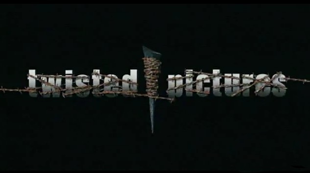
Here's a few examples of production company logos that we will use to design ours .

This is our film poster, we designed it after researching other posters for films of the same genre

We deigned our our logo after researching other film production company logos
We will be filming and editing our film through the months of march, april and may so the release date in cinemas will be around the first weekend of june and it will stay in theaters for a maximum of 3 months. The film will be released on DVD just before christmas in december which will boost sales due to the 'christmas rush'.
No comments:
Post a Comment