http://www.bilborough789.blogspot.co.uk/
my preliminary tasks from the start of the year.
Wednesday, 25 April 2012

Saturday, 21 April 2012
Question 2
the victims appear to be a very working class family this is shown by the setting, the fact that they live on a farm and how the other members of the family are dressed and the decor of the house. the threat is unknown so has no social grouping. the female is the victim as she is seen as venerable and innocent which makes the possession a dramatic change from her normal character. the age gender and race of the female victim are very stereotypical of this genre of film as she is a young, working class, white girl which makes her seem vulnerable to the threat.
The characters seem to be a very middle class working family, the size of their house, decor and lifestyle hint at this throughout the clip. the victim again is a young, middle class, white woman. this seems to be a continuos stereotype of the victims in satanic/ possession films as they seem vulnerable and almost an easy target. the threat is portrayed as a much lower class, rebellious and dangerous man which creates fear as he is a violent character.
 we chose this actress as our victim as she also fits the stereotype seen in other films of the same genre we made her dress in a certain way for the filming which would imply that she was from a middle class background however we also tried to make her look as innocent, vulnerable and isolated as possible.
the first minute of our film is showing our victim walking to a derelict house, this helps the audience establish who the victim is as you see them from all angles and have time to take in their clothing, race, age and gender. This is the same in the shining as the camera follows the car driving along the mountain road, this allows you to make judgements on the characters based upon where they are driving what car they are in etc. it also shows the viewer where the film is set and in what time period
 wordle of the feedback on our the issues of representation of age, gender and race in our horror film.
The characters seem to be a very middle class working family, the size of their house, decor and lifestyle hint at this throughout the clip. the victim again is a young, middle class, white woman. this seems to be a continuos stereotype of the victims in satanic/ possession films as they seem vulnerable and almost an easy target. the threat is portrayed as a much lower class, rebellious and dangerous man which creates fear as he is a violent character.
the first minute of our film is showing our victim walking to a derelict house, this helps the audience establish who the victim is as you see them from all angles and have time to take in their clothing, race, age and gender. This is the same in the shining as the camera follows the car driving along the mountain road, this allows you to make judgements on the characters based upon where they are driving what car they are in etc. it also shows the viewer where the film is set and in what time period

Thursday, 19 April 2012
Question 1
Our production company logo

Logo from an existing film

Our Titles

titles from an existing film

An image that established sub genre

An image from an existing sub genre

an image that established the character

an existing image that established character

An image that establishes mise en scene

An existing image of mise en scene

4 other key images.


4 Key images from an existing film
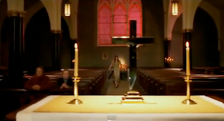
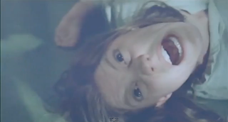


These images all contain connotations of death in colour, the use of reds and backs. most also contain some kind of religious artifacts or symbols hinting at the sub genre of the film and keeping with the conventions of these. the two main photos that show this are of the young girl in the church and of the house as they both create tension due to location and mise en scene.
The titles used are all black and white, this keeps within the conventions of our sub genre as these colors have connotations of death and depression, some red is also used which has connotations of blood and the devil which are also in-keeping with our sub-genre.

Logo from an existing film

Our Titles

titles from an existing film

An image that established sub genre

An image from an existing sub genre

an image that established the character

an existing image that established character

An image that establishes mise en scene

An existing image of mise en scene

4 other key images.


4 Key images from an existing film
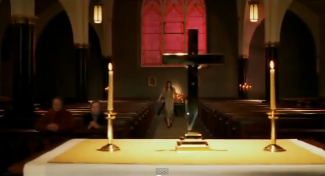


These images all contain connotations of death in colour, the use of reds and backs. most also contain some kind of religious artifacts or symbols hinting at the sub genre of the film and keeping with the conventions of these. the two main photos that show this are of the young girl in the church and of the house as they both create tension due to location and mise en scene.
The titles used are all black and white, this keeps within the conventions of our sub genre as these colors have connotations of death and depression, some red is also used which has connotations of blood and the devil which are also in-keeping with our sub-genre.
Wednesday, 28 March 2012
Our Final Horror Film: Pit Lane
This is our final finished horror film 'Pit Lane'. We think it went well and turned out better than originally expected and we finished out film within plenty of time, we made sure that the continuity flowed and that the music was in time with the visuals.
Thursday, 1 March 2012
Question 3
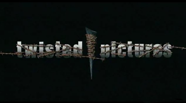

Screen Gems is a small american production company and is not as well known as other larger more mainstream companies such as universal or lionsgate. it is mainly known for it's short films and animations however it's latest releases have been much higher budget and they are now becoming a larger more recognizable company.
The logo is unusually dark as it has been changed to fit with the horror genre of the film, the logo and words swirl onto screen and keep our attention throughout the clip. this is a very extravagant production logo compared to others we have seen as it is very modern.
The exorcist was produced by 'Warner Brothers'. Again the text is very bold and in block and bold colour, the colors used (black, white and red) have conventions of blood and death which links them to the horror genre. The logo moves onto the screen very quickly and the words fade in after, this means the audience focus on each piece of information individually as there is only once thing on the screen at a time. the logo and the words are again very central on the screen to make them the main focus.
Warner Brothers are a very classic production company and are not known for making horror films, they mainly produce blockbuster family films such as rom-coms and action and adventure films.
The poster i have created, will be displayed in many public places to get the film out and known by the public, places I will distribute the posters will be those such as; billboards, telephone boxes, and general TV advertisements. With the film being released in the summer, it would be a good idea to start releasing trailer footage about a month beforehand on TV and before a similar horror film is shown in the cinema as this would be the target audience for our film.

This poster contains the same features, the hand, as the film poster we produced.


The poster i have created, will be displayed in many public places to get the film out and known by the public, places I will distribute the posters will be those such as; billboards, telephone boxes, and general TV advertisements. With the film being released in the summer, it would be a good idea to start releasing trailer footage about a month beforehand on TV and before a similar horror film is shown in the cinema as this would be the target audience for our film.

This poster contains the same features, the hand, as the film poster we produced.


Here's a few examples of production company logos that we will use to design ours .

This is our film poster, we designed it after researching other posters for films of the same genre
We deigned our our logo after researching other film production company logos
We will be filming and editing our film through the months of march, april and may so the release date in cinemas will be around the first weekend of june and it will stay in theaters for a maximum of 3 months. The film will be released on DVD just before christmas in december which will boost sales due to the 'christmas rush'.
Thursday, 9 February 2012
Question 4
Suitable only for 15 years and over
No one younger than 15 may see a ‘15’ film in a cinema. No one younger than 15 may rent or buy a ‘15’ rated video work.
Discrimination
The work as a whole must not endorse discriminatory language or behaviour.
Drugs
Drug taking may be shown but the film as a whole must not promote or encourage drug misuse. The misuse of easily accessible and highly dangerous substances (for example, aerosols or solvents) is unlikely to be acceptable.
Horror
Strong threat and menace are permitted unless sadistic or sexualised.
Imitable behaviour
Dangerous behaviour (for example, hanging, suicide and self-harming) should not dwell on detail which could be copied. Easily accessible weapons should not be glamorised.
Language
There may be frequent use of strong language (for example, ‘fuck’). The strongest terms (for example, ‘cunt’) may be acceptable if justified by the context. Aggressive or repeated use of the strongest language is unlikely to be acceptable.
Nudity
Nudity may be allowed in a sexual context but without strong detail. There are no constraints on nudity in a non-sexual or educational context.
Sex
Sexual activity may be portrayed without strong detail. There may be strong verbal references to sexual behaviour, but the strongest references are unlikely to be acceptable unless justified by context. Works whose primary purpose is sexual arousal or stimulation are unlikely to be acceptable.
Theme
No theme is prohibited, provided the treatment is appropriate for 15 year olds.
Violence
Violence may be strong but should not dwell on the infliction of pain or injury. The strongest gory images are unlikely to be acceptable. Strong sadistic or sexualised violence is also unlikely to be acceptable. There may be detailed verbal references to sexual violence but any portrayal of sexual violence must be discreet and have a strong contextual justification.
Suitable only for adults
No-one younger than 18 may see an ‘18’ film in a cinema.
No-one younger than 18 may rent or buy an ‘18’ rated video.
In line with the consistent findings of the BBFC’s public consultations and The Human Rights Act 1998, at ‘18’ the BBFC’s guideline concerns will not normally override the principle that adults should be free to choose their own entertainment. Exceptions are most likely in the following areas:
- where the material is in breach of the criminal law, or has been created through the commission of a criminal offence
- where material or treatment appears to the BBFC to risk harm to individuals or, through their behaviour, to society – for example, any detailed portrayal of violent or dangerous acts, or of illegal drug use, which may cause harm to public health or morals. This may include portrayals of sexual or sexualised violence which might, for example, eroticise or endorse sexual assault
- where there are more explicit images of sexual activity which cannot be justified by context. Such images may be appropriate in ‘R18’ works, and in ‘sex works’ (see below) would normally be confined to that category.
In the case of video works (including video games), which may be more accessible to younger viewers, intervention may be more frequent than for cinema films.
Sex education at ‘18’Where sex material genuinely seeks to inform and educate in matters such as human sexuality, safer sex and health, explicit images of sexual activity may be permitted.
Sex works at ‘18’Sex works are works whose primary purpose is sexual arousal or stimulation. Sex works containing only material which may be simulated are generally passed ‘18’. Sex works containing clear images of real sex, strong fetish material, sexually explicit animated images, or other very strong sexual images will be confined to the ‘R18’ category. Material which is unacceptable in a sex work at ‘R18’ is also unacceptable in a sex work at ‘18’.
The audience for our horror film would be late teenagers to young twenties, this is due to this being the general audience for horror movies. However, our secondary audience would be teenagers above the age of 15 due to the film being given a 15 certificate, also with the target audience being such a small range, this does not mean that other ages cannot watch the film and the actual viewing statistics of the audience may show that out target audience was not met and we should have given a different target audience.
Subscribe to:
Posts (Atom)